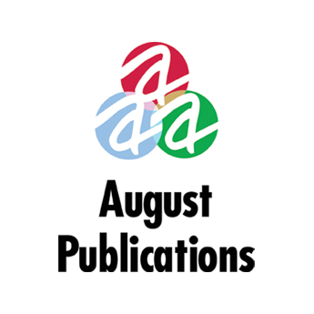
Branding :: logo
August Publications: Trio Logo
When website and book publisher August Publications experienced a sudden company growth, the demand for its wealth of knowledge within the sports industry also expanded to other areas. With the addition of new lifestyle-based sites like Yellowstone Insider and sustainability-focused sites like Green Sports Venues, the original red-and-black logo became the sports-based parent on which the company was founded, while the blue and green versions of the original mark represented the two new branches of the company's offerings. The overlapping RGB triangle was a nod to all of the sites' larger focus on video chronicles that support editorial content.


